Introduction
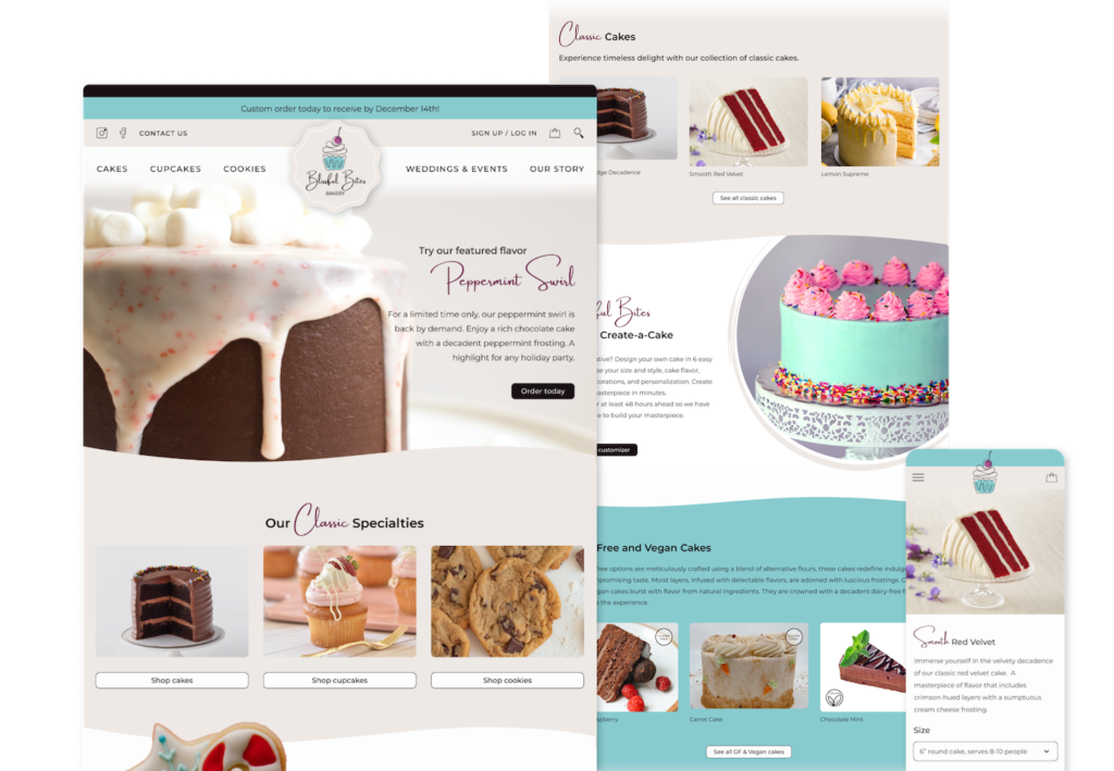
Imagine yourself strolling through a charming local bakery, enticed by the delicious cakes, cookies, and cupcakes. The Blissful Bites Bakery could be that local baking business. Despite having a strong community connection, the business would like to expand their online presence and entice customers with the convenience of online ordering. This responsive website will showcase scrumptious products to browse, empower customers to take charge of their bakery experience by customizing products, and display a user-friendly interface that includes a hassle-free check out process. A bakery customer can find classic versions of cakes, cookies, or cupcakes that they can order and pick up, they can submit a custom order where the baker designs, or they can have some fun and be creative to design their own. Users can easily identify ingredients and allergens found in each baked good. The website hopes the online experience will be as smooth and satisfying as the products themselves.
Background
Operating a small baking business involves navigating many challenges. Some bakeries fail to prosper for a variety of reasons such as marketing and branding, tracking financials, and pricing goods. While passion for baking and creating delicious treats is what fuels many entrepreneurs to open a baking business, the demands of daily operations require efficient solutions. Beyond crafting beautiful and delicious treats, bakers juggle the day to day operations, manage deadlines for significant events, experiment with new creations, keep track of ingredients and allergens, and fulfill incoming orders. With these demanding workloads in mind, I aimed to design a responsive website that empowers a locally owned bakery to attract new customers, improve their online presence, and highlight unique features which set them apart from competitors.

I wanted to discover what challenges people faced when ordering baked goods from a small bakery business.
Research
Market research
I began by conducting market research to learn more about the bakery business and its future success outlook.
According to bakingbusiness.com, “the baking industry is in a strong position as it looks ahead.” The 2020 pandemic challenged the baking business, but it pushed through due to the ability to offer to go products and delivery. The expansion of online ordering options has also increased the demand.
Specialty bakeries are also growing in demand. According to prnnewswire.com, there is an increased interest in organic and gluten-free baked goods. There is a “growing demand for functional ingredients that are health-promoting and energy-boosting.”
Competitive analysis
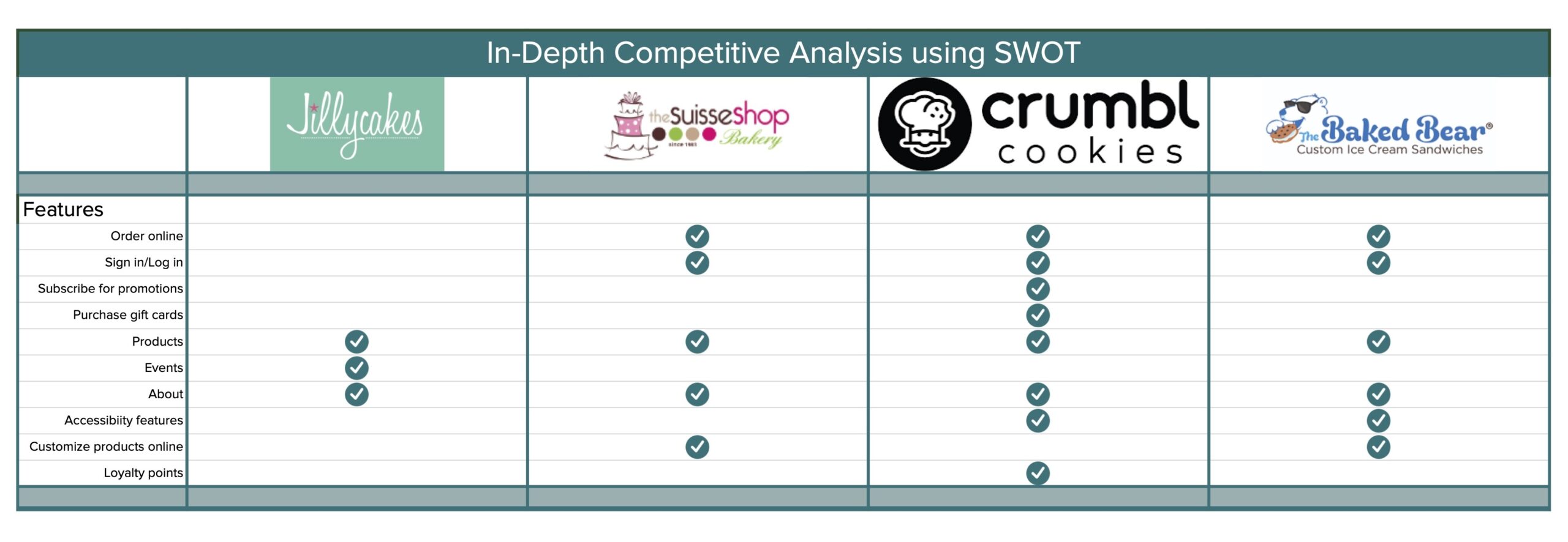
To gain broader insights on the current bakery market, I completed a competitive analysis. I focused on exploring two small bakery businesses which would allow me to see similar products and services. Additionally, I looked into two secondary competitors that were trending in the sweet treats industry. These were large companies that have a national presence. All of these competitors were analyzed in regards to the features the website had, their ease of use, strengths, weaknesses, and accessibility. Features found are shown below.
Competitive analysis findings
Small bakeries provided high quality photographs and detailed information about their products. Custom orders were submitted by forms asking for descriptions or images of what they would like.
Two bakeries provided customers with the ability to customize products, pick out flavors and mix and match different ideas, to be ordered and picked up.
There were some concerns with the accessibility of the local bakery websites in the areas of readability and insufficient color contrast. The large company websites did not have this same concern.
Only one bakery had the ability to subscribe to receive up to date information and offers.
Each bakery proudly shared their story of how they got started and the connection with the community in which they first served.
One bakery that did accept online orders, had the ability pause that feature during periods of high demand or staffing shortages.
Summary of findings
There is a way for a small bakery business to set themselves apart from competitors. Developing a responsive website that gives customers the convenience of ordering goods online and the creative ability to customize and design their own cakes, cookies, and cupcakes, not just personalization but flavors and decorations as well.
Furthermore, by sharing the bakery’s story and highlighting their involvement in the community, the website could promote a sense of connection between customers and the local business.
Lastly, ensuring that all website colors choices for text and backgrounds follow accessibility standards.
User survey
A user survey was conducted to gain insights on customer habits and preferences. Three observations were made while analyzing the survey results.

Observation one
People are willing to purchase many different products online as long as there are compelling photos of the product and clear descriptions of it. If the process is easy, they will do it.

Observation two
Users seek greater control over their purchases and want to be able to customize their baked goods.

Observation three
Users want transparency on ingredients and allergens so they can make the best decisions for their health and safety.
User interviews
To dive deeper into the motivations and experiences of bakery customers, I conducted user interviews. I hoped to learn about the reasons customers choose the bakeries they do, as well as what frustrations they encounter in the ordering process or with how bakeries operate in general.

Five interviews were conducted with both male and female participants.

All participants utilize bakeries to purchase goods for themselves or for special events.
One participant had worked in a bakery in high school.

4 out of 5 were connected to someone that has a serious allergy that a bakery would need to be aware of.
Customers would like an online ordering option that is simple to use.
Although participants often stop into bakeries, they want the option to order online for special occasions. Feedback was clear that they need to know specific product details like the price upfront, the details of the product, and how many people it would serve.
There is a need for transparency on allergens and ingredients in baked goods.
Many participants knew friends or family that have a food allergy or dietary restrictions. For this reason, it is important to show customers what ingredients and allergens are in their products and offer options that are vegan and gluten free.
Customers want to be informed.
Participants stated that they would like to be informed about featured flavors, limited time products, and special offers. A reminder by text or email to order or pre-order is a nice option so that they don’t miss out.
Research participants want to be able to customize what they are ordering.
Participants would like to be able to make the bakery item their own and customize the details. Choosing flavors, frostings, personalization to make it special for the occasion.
POV
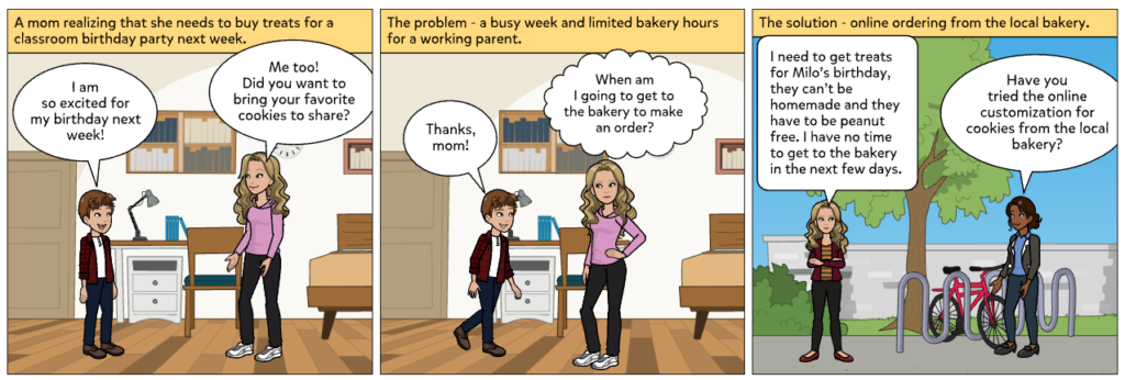
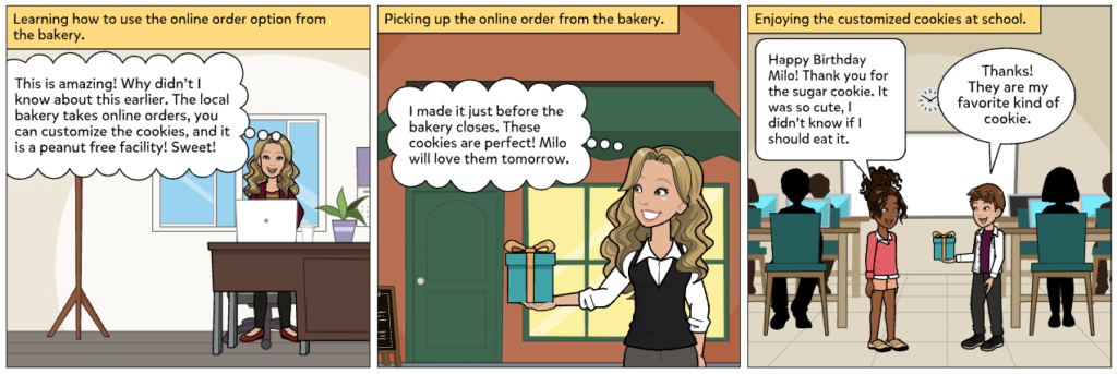
I'd like to explore online ordering features that a user could use to customize a bakery order because they are wanting to purchase a bakery product that is personal and unique.
How might we...
- help bakery customers order efficiently online, being able to customize their baked goods and see a preview of what it could look like?
- help bakery customers learn about allergens quickly so that they can make an informed decision on if the baked goods are safe for them?
- keep bakery customers up to date about time sensitive bakery offers?
- inform bakery customers about local events and fundraisers the bakery is participating in?
- help bakery customers make the best decision on what size of cake to purchase?
- make sure that all bakery customers are able to utilize the features on the website?
Define
Problem

Bakery customers revealed that bakeries don’t always have the detailed information needed to successfully and confidently order baked goods online.
Customers emphasized that bakery websites are not always clear on if they offer products that are allergen free.
Bakery customers expressed frustration when they miss out on special pre-orders or limited time offers at their local bakery.
Bakery customers shared the desire to have the option of designing their own products.
Solution
My solution tackles the key problems identified through my research and proposes to design a responsive bakery website that is detailed and transparent so the user can easily access all of the information needed to make an informed decision and order online.
Create a responsive website that has:
- the ability to pre-order new, time sensitive products
- clear menu with flavors, pricing, images, size, servings
- easy to see “earliest pick up date” before starting the order process
- ability to customize orders including personalization
- information on local events that the bakery is participating in
- sign up option for featured products and monthly offers
- clear labels on allergens and if it is a nut free facility
- clearly stated hours of operation and location
Website features
After identifying the problems and brainstorming solutions, possible features of this website were mapped out. I prioritized the must have features that would need to be developed right away for the business to function. I also brainstormed surprising features that would set it apart from other local bakeries. A complete list of features and the justification for them can be found at the link below.
- Account creation
- Online ordering
- Menu of products
- Allergen information
- Featured flavors
- Limited time offers
- Customizable products
- About the bakery
- Subscribe for email updates
- Social media feeds
- Accessible design
Identifying the user
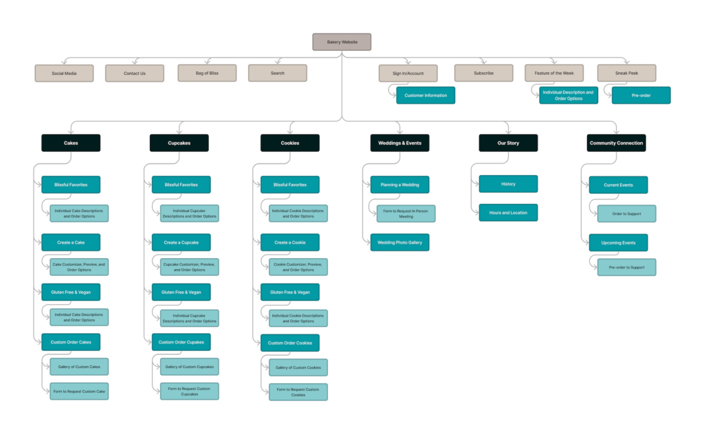
Sitemap
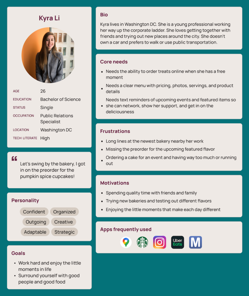
With Kyra and Teresa, my user personas, firmly in mind, the next step was to develop a sitemap.
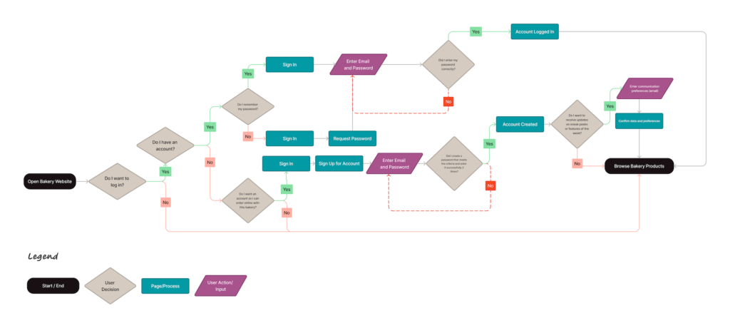
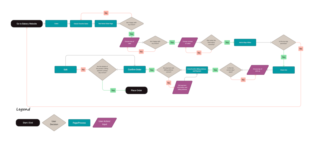
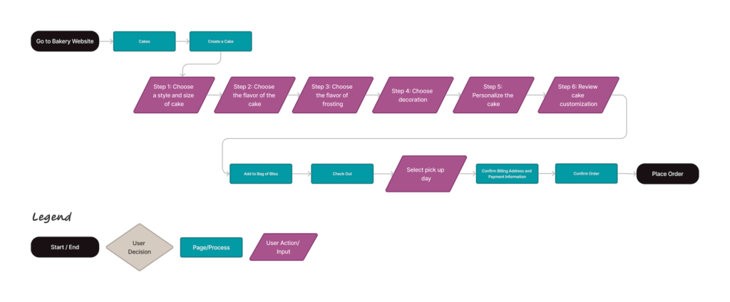
User and task flows
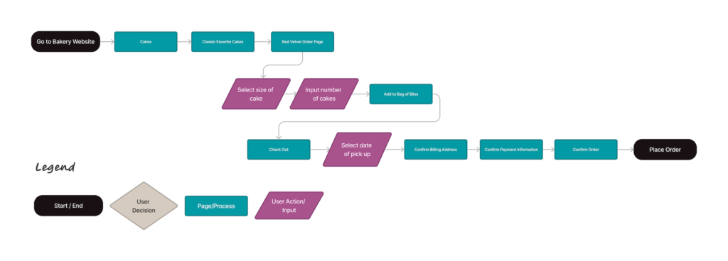
After a sitemap was constructed, my next step was to delve deeper into my user experience by creating user flows and task flows.
Design
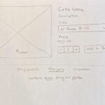
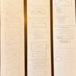
Low and mid-fidelity wireframes
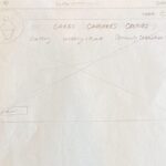
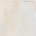
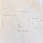
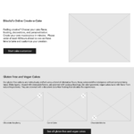
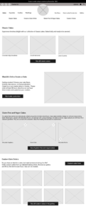
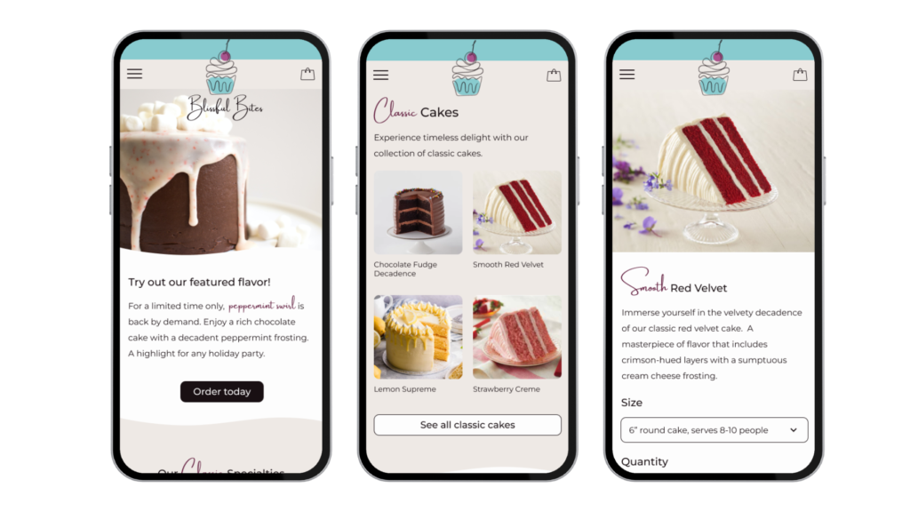
After thinking through the website architecture and creating user and task flows, I began sketching mobile ideas for the landing page. With a focus on user needs and frustrations, I included having a hero section that showcased the feature of the week. I also added sections on the landing page for customers to scroll through to highlight what the bakery has to offer. However, knowing there may also be a loyal customer base, I designed the navigation to provide quick and easy access to bakery products and information if the user knows exactly what they want. After designing the mobile and desktop landing pages, I worked through secondary pages and my user and task flows. When I felt I had my low-fidelity sketches ready, I discussed various website headers with other designers to narrow down what might be best for the bakery website. I decided on the center alignment for the logo because this is the seal that the bakery will use on its products and it provides balance and symmetry to the page.
Click designs to expand
Low-fidelity wireframes
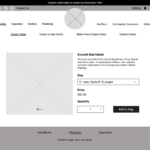
Mid-fidelity wireframes
Mobile wireframes
Desktop wireframes
Mid-fidelity usability testing
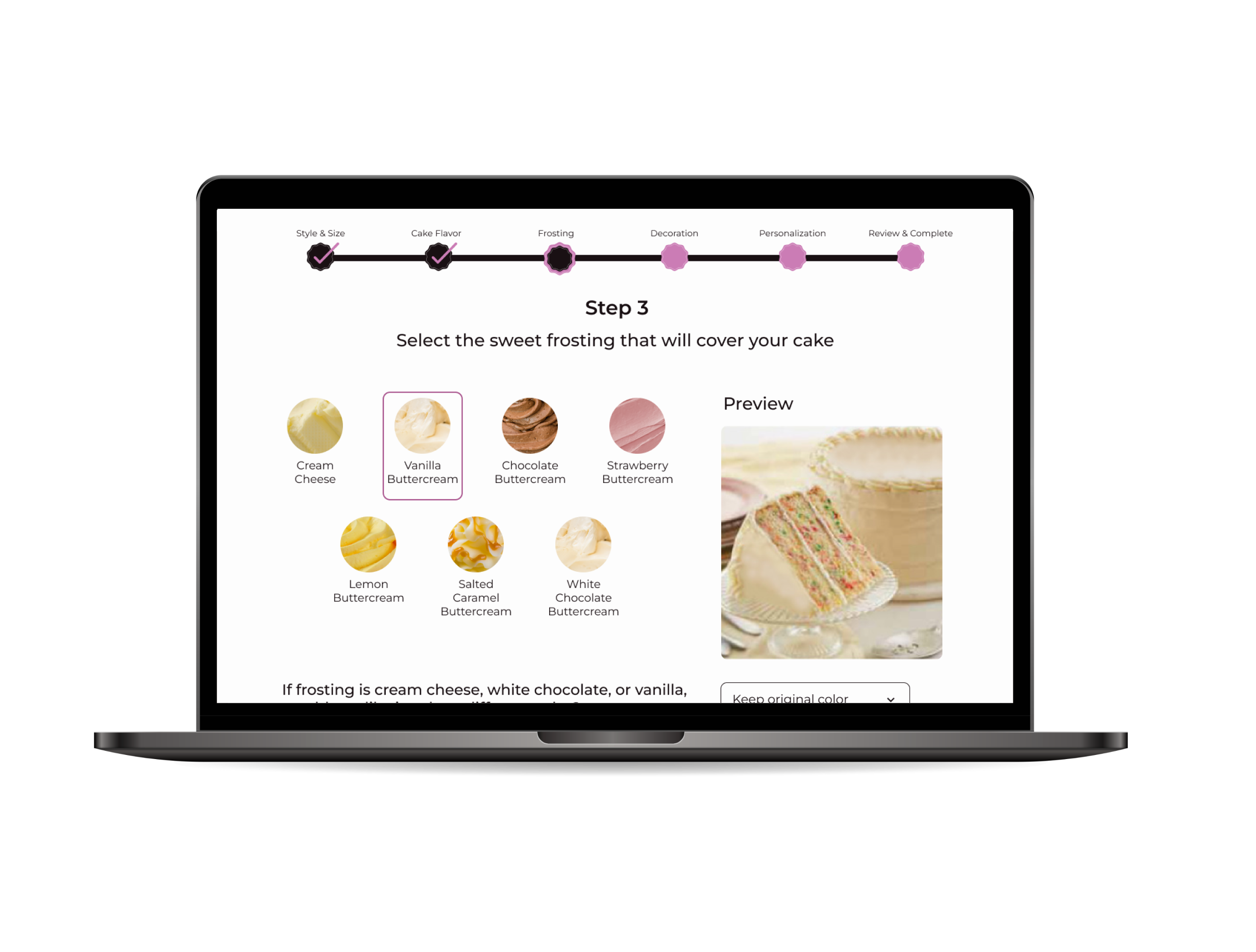
After completing my mid-fidelity wireframes, I scheduled usability tests. These tests were to evaluate the information architecture and to identify any problems in structure before starting the high-fidelity wireframes. No major issues were identified, but small improvements were made. User feedback revealed the need for clarity on the sign in option. It was unclear that this was also the sign up option, so making that obvious was very important. When selecting a pickup date, having the location of the bakery was an addition, especially if there were multiple bakeries. Lastly, adding labels to the create-a-cake progress bar so that users could move through the customization process with confidence. All of these changes were noted and applied to the high-fidelity wireframes.
Brand design and logo
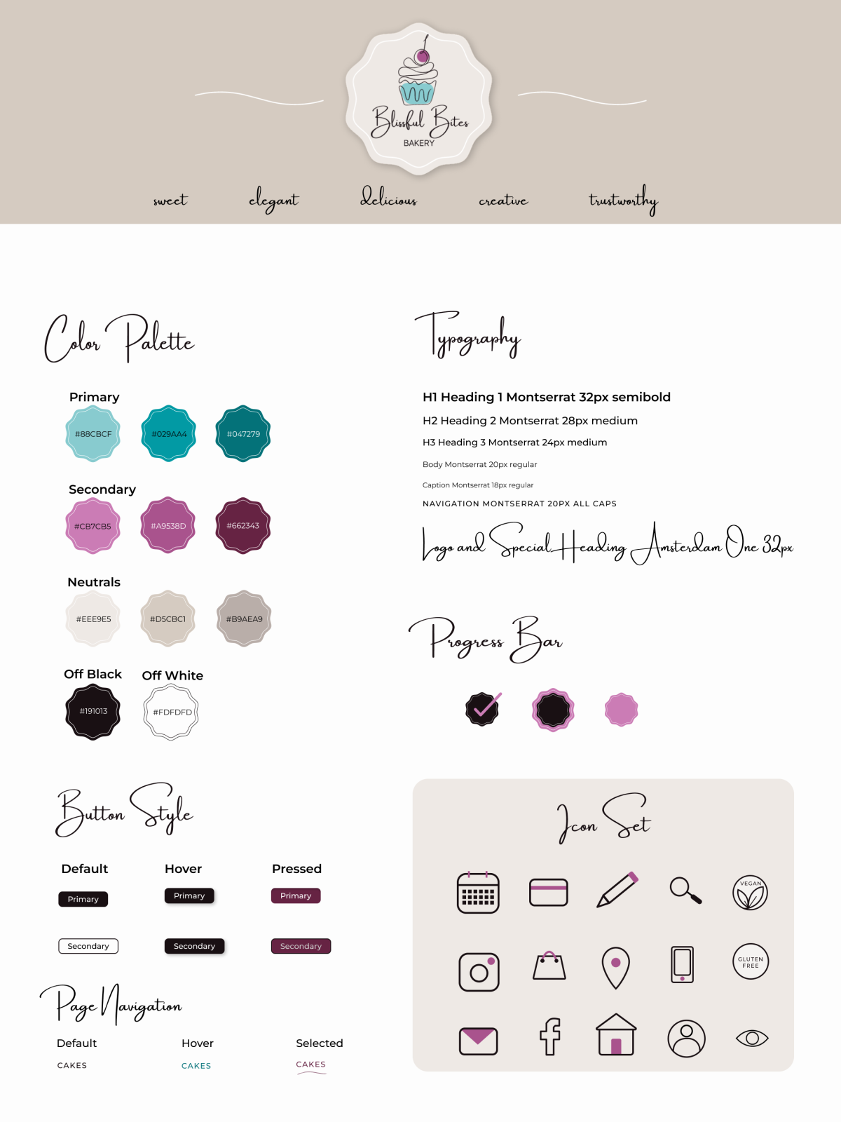
A logo was designed to help develop the Blissful Bites brand identity. Focusing on their core brand values of elegance, creativity, trustworthiness, and their bakery goods that are delicious, and sweet.
Typography
A legible and neutral font, Montserrat, was chosen for the main paragraph text and headings of the website. It sizes well in buttons, headings, and menus. This font prioritizes accessibility with its tall x-height which will provide maximum readability on mobile devices. To emphasize hierarchy, I used different weights and sizes throughout the website. I also added an artistic font, Amsterdam One, for personality and elegance.
Colors
A primary hue of teal and secondary pink hue were chosen to represent the trustworthiness of the bakery along with the emotions that come with celebrations. An off-white was chosen for the background to represent frosting. All font colors were tested against backgrounds for readability and scored an AA 4.5 or higher to meet or pass those standards.
High-fidelity wireframes
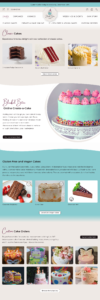
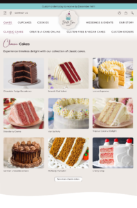
Having established the website’s branding and upon completion of the usability testing, I began to work on the high- fidelity wireframes. I created text styles and color styles in Figma and began to develop components for both mobile and desktop versions. I used my mid-fidelity wireframes as a guide but made changes as needed along the way. I kept in mind my user personas, and developed a fun bakery website with a touch of elegance.
Mobile
Click designs to expand
Desktop
Click designs to expand
Prototype
Usability testing and insights
I was able to conduct 5 moderated usability tests through Google Meet, and 2 unmoderated usability tests through Maze. These usability tests brought valuable insight on the functionality and effectiveness of the design from the perspective of a typical bakery customer.
Testing the sign up and log in task flow
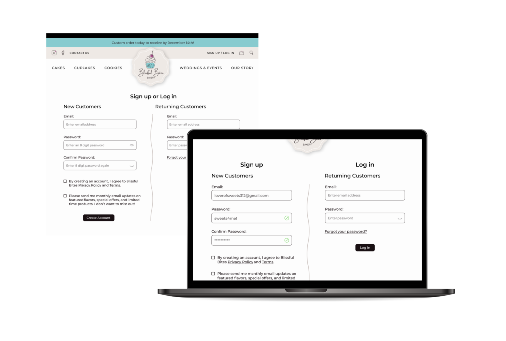
The first task flow that I tested was the process if signing up for an account with the bakery. All users were able to easily sign up for an account and choose if they would like the bakery updates on featured flavors and limited time offers. It took users an average of 25 seconds to go through this process. After observing some hesitation on the 2 column option of sign up and login, I decided to create separate headings to help clarify each column. I also added a password match success to make sure users felt confident in creating the password they wanted.

Ordering a classic cake
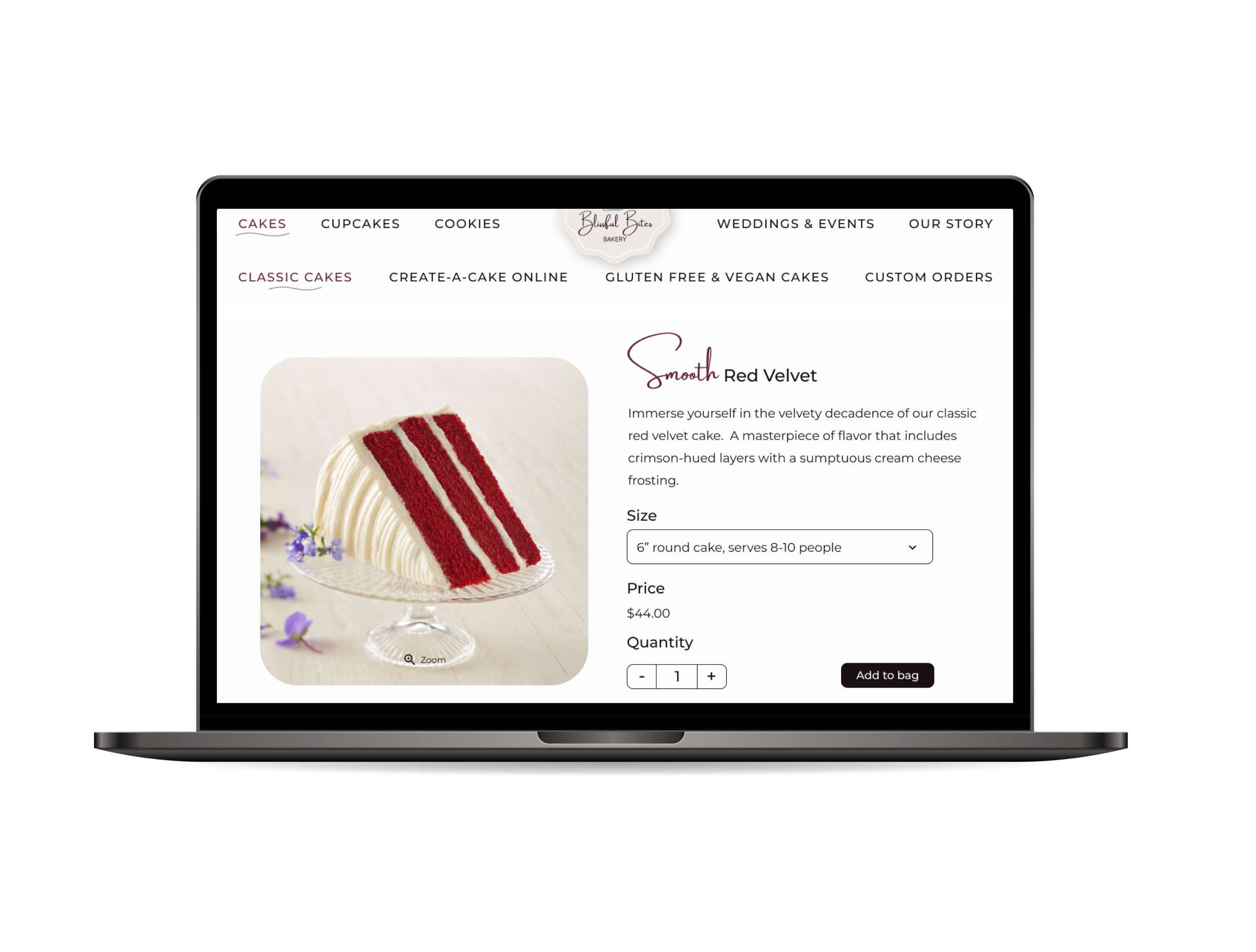
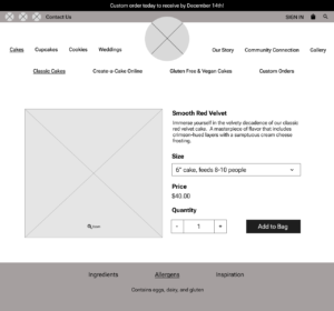
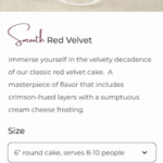
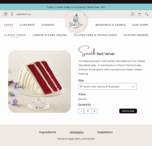
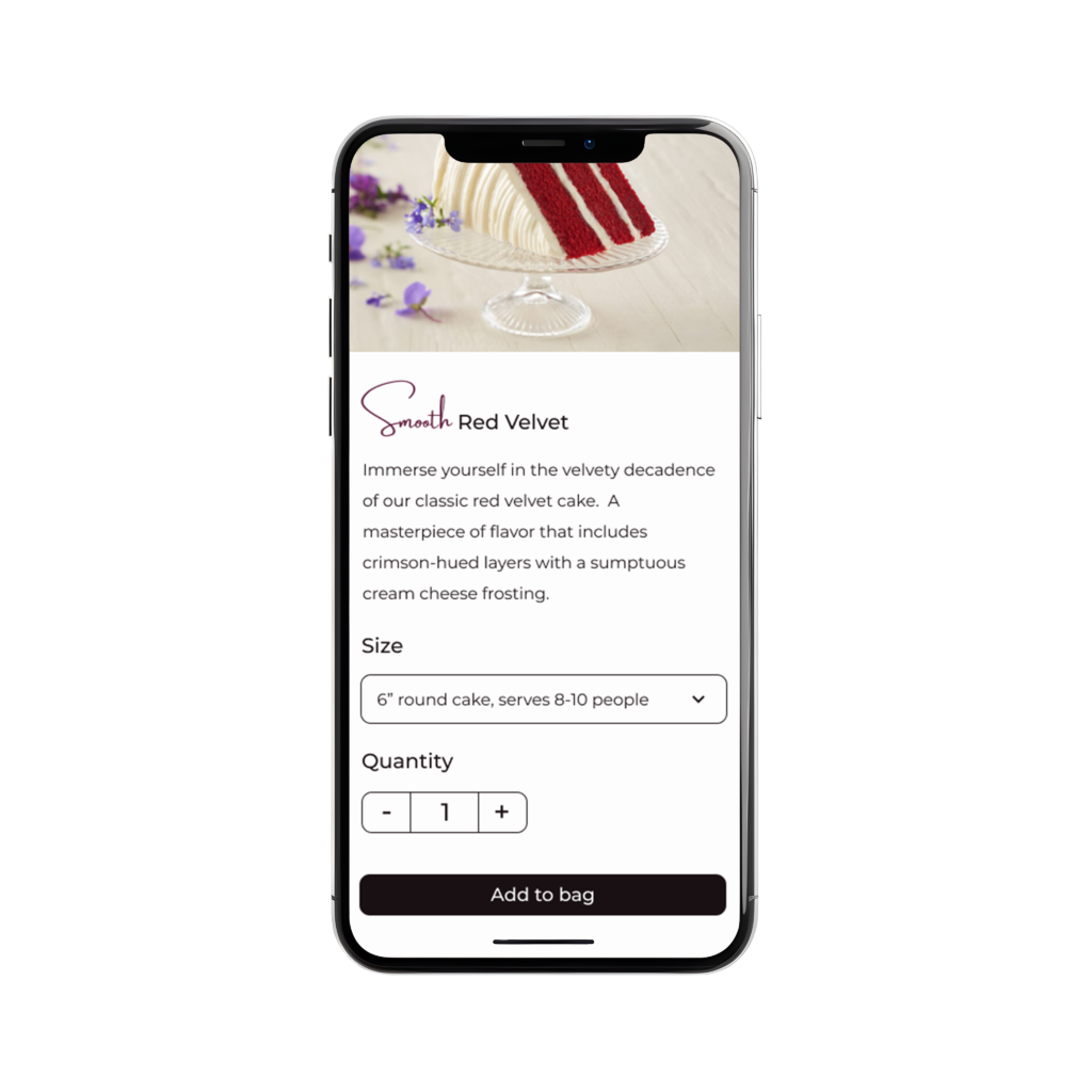
Recognizing the importance of being able to find and purchase the product the user wants was tested next. The task was to find a classic red velvet cake and add it to the bag.
All participants were successful at completing this task. A few users commented that the serving size was helpful when determining which size of cake to purchase. It took on average, 27 seconds to find the cake and add it to the bag. No concerns were voiced with this task and all users were satisfied with it.

Testing the check out process
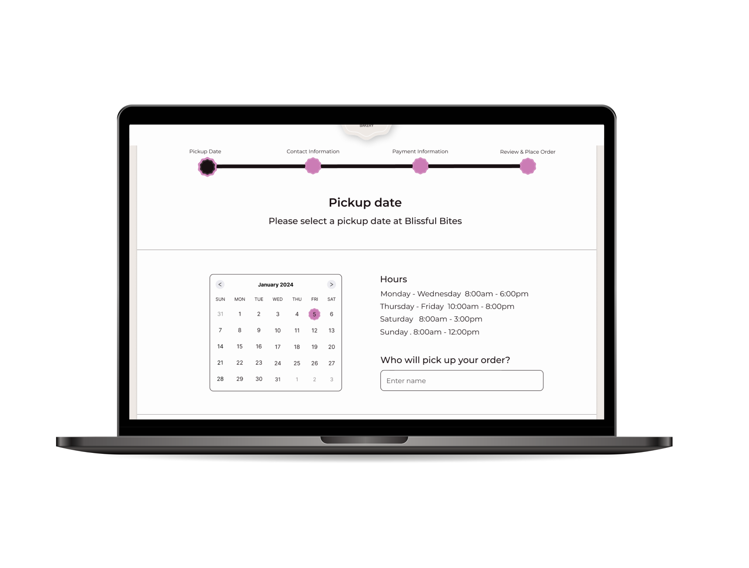
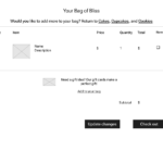
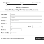
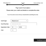
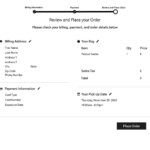
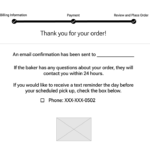
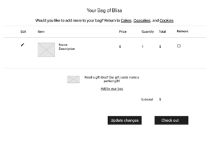
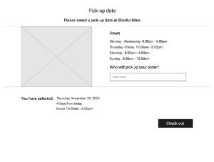
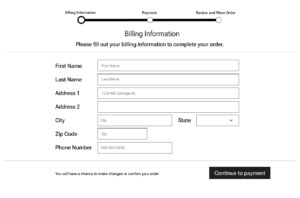
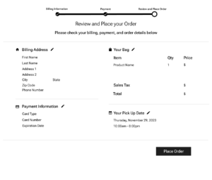
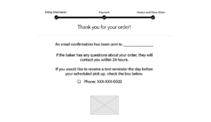
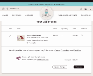
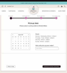
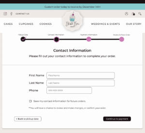
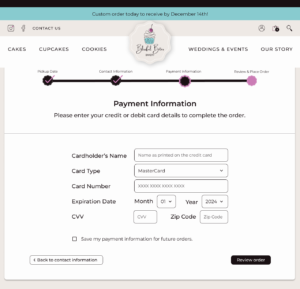
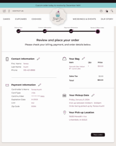
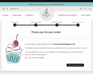
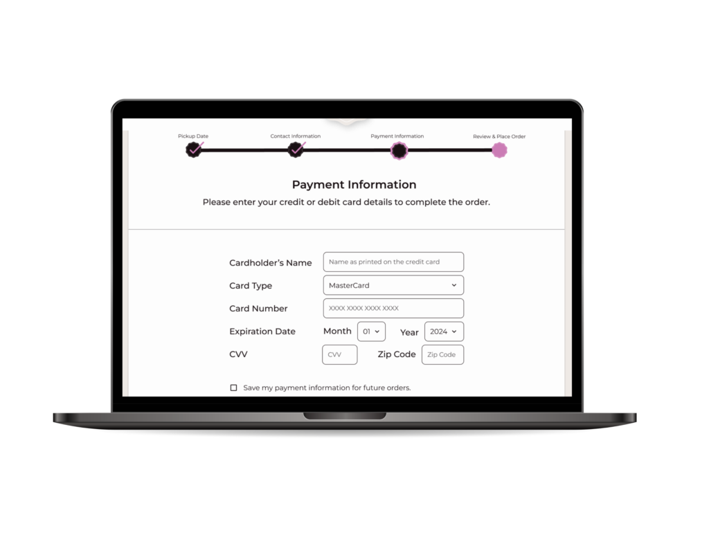
Once the user added the cake to the bag, I tested the efficiency of the check out process. My goal here was to make the process as easy as possible so that bags would not be abandoned during the check out. All users were able to successfully purchase their cake. It took an average of 1 minute and 24 seconds to move through the 4 check out screens. Based on user feedback, a few changes were made to clarify the process.
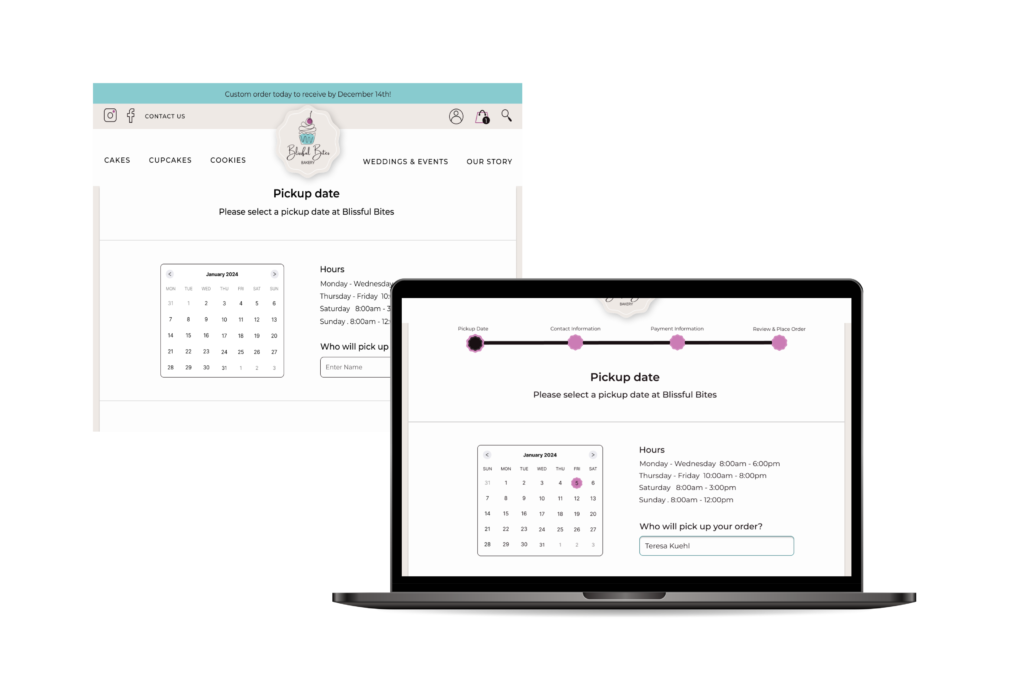
The first iteration was adding the pickup date to the progress bar to show that it is part of the check out process. The calendar was also tweaked to make sure the date selected is highly visible and the calendar runs Sunday to Saturday.

In further research of check out flows, I decided to refine the personal information collected to focus on what was truly necessary. The billing information was changed to contact information in order to eliminate the need for a full address. Since there is not a shipping option, name and phone number should be sufficient for the bakery. The zip code was added to credit card information as another form of security.
Editing an order
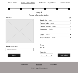
The next task was editing an order from the review page. I prioritized making order modifications clear and efficient on this page. In this flow, the user was directed to change their mind on the pickup date. With an average of 24 seconds, all participants were able to easily edit and update this information and return to the review order page directly. No changes were made in this process as the edit icons were clear and changes were made easily. Users appreciated not having to reenter all their payment details when changing their mind on a product or date.

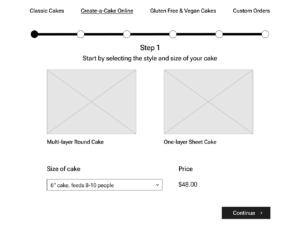
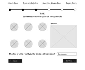
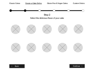
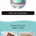
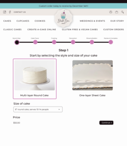
Create-a-cake task flow
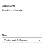
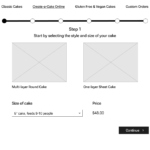
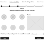
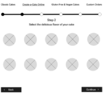
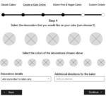
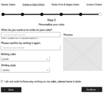
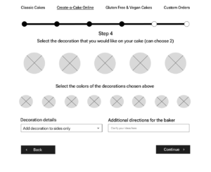
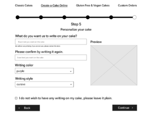
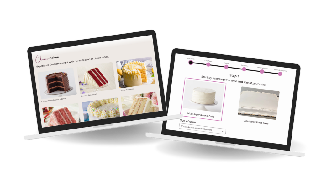
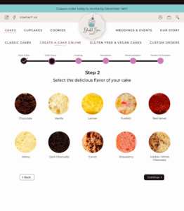
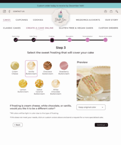
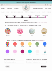
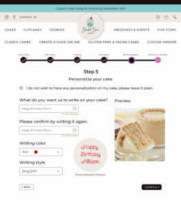
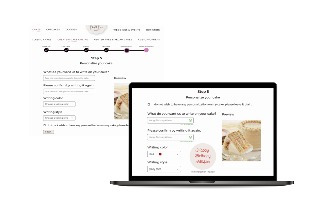
The final task flow tested the functionality of the online create-a-cake feature. This task had the user create a special cake for a friend and go through the 6 steps that allowed users to customize the cake. Because of the many choices and directions, this task was only tested with the moderated usability tests. All participants were able to successfully create a cake. The feedback on this feature was very positive and they loved that there was a photo preview of what the cake would look like. Times varied on this task due to discussions along the way, but it averaged about 4 minutes. Even though it was positive and successful a few small modifications were made. On the personalization page, a writing success match was added so that users could feel confident that they did not have a typo with what they wanted written on the cake. I also added a maximum number of characters that would change depending on the size of the cake. The check boxes for no personalization or decoration were moved to the top for users that would like to move through quickly and not pick those options.

Task flows
Task 1: Imagine you are a new user and would like to sign up for an account with the Blissful Bites Bakery.
Task 2: As a regular customer, you are interested in adding an 8″ red velvet cake (a classic cake) to your bag.
Task 3: You decide one cake is enough today and are ready to check out to purchase the red velvet cake. You would like to pick it up on Friday, January 5th.
Task 4: Oh no, you can’t pick the cake up on the 5th. Change the date you are picking up the cake to Thursday, January 4th before checking out.
Task 5: You just heard that you can create your own cake on this website! Use the create-a-cake customizer to create a round, 8″ funfetti cake with vanilla buttercream frosting. Add rainbow sprinkles and keep the original frosting color. Put sprinkles along the top edges only and make sure the baker is clear on your directions. Personalize the cake for your friend Allison. She likes red and fancy print writing. Name your cake and add it to your bag.
Reflect
If I had more time I would:
- conduct more usability tests with a wider audience to gather ideas from a diverse group
- consult with a bakery to gain industry insights that I may have overlooked
- prioritize designing the mobile version of the website, focusing on all task flows
- invest in a photographer to take uniform pictures of the products being made at the bakery, making sure they align with the branding of the website
- develop the cupcakes and cookies sections of the website
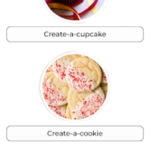
- design the create-a-cookie and create-a-cupcake customizers
What I learned:
This project has helped me grow as a UX designer in many ways.
This project has helped me navigate diverse perspectives. I learned that when researching there can be many different opinions and viewpoints, and in the end you have to define your user and keep their frustrations and needs at the center of every decision.
I learned that prototyping intricate task flows with numerous choices can be challenging. So much is dependent on the choice the user makes and the order in which they make it.
This project reinforced the value of developing a strong and specific UI kit, so that consistency can be maintained and that elements can be added easily and customized as needed.
Final thoughts:
My goal, when I set out to make a bakery website, was to achieve a harmonious blend of UI design and functionality. I also wanted to prioritize the needs of the customers, limit the extra work of the baker, and make it aesthetically pleasing. I feel that a visually engaging website was created that evokes a sense of sweetness, excitement, and elegance. I believe the create-a-cake option brings out the child in all of us, and would be a feature that would keep users coming back for more.
Sources
Atchley, C. (2023, March 27). Baking industry outlook remains positive despite challenges. Baking Business. https://www.bakingbusiness.com/articles/58731-baking-industry-outlook-remains-positive-despite-challenges
Technavio. (2022, May 26). Specialty Bakery market to record 2.45% Y-o-y growth rate in 2022: Need for free-from food is a major trend to fuel the market: Technavio. PR Newswire: press release distribution, targeting, monitoring and marketing. https://www.prnewswire.com/news-releases/specialty-bakery-market-to-record-2-45-y-o-y-growth-rate-in-2022–need-for-free-from-food-is-a-major-trend-to-fuel-the-market–technavio-301554938.html
If any of the images of delectable bakery treats peaked your interest, check out the following bakeries: Cake Confectionary, Echo’s Cookies, Cains Creative Cakes, Noe Valley Bakery, Magnolia Bakery, Anna Banana, Gold Belly, Shop National Bakery, Completely Delicious and Life, Love, and Sugar
View other case studies
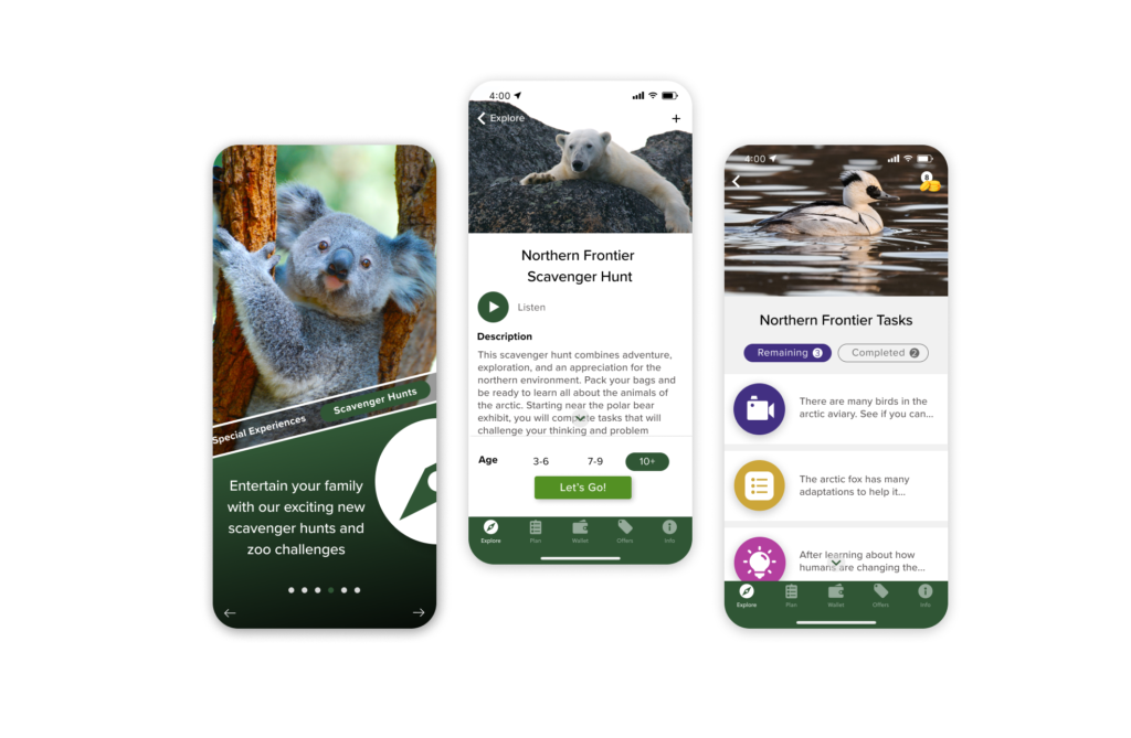
San Diego Zoo App – adding a scavenger hunt feature that provides children and adults an interactive and engaging new way to experience the zoo

inspireED – a mobile app that redefines the way parents, students, and community members connect to volunteer with school districts

